Architecture and design
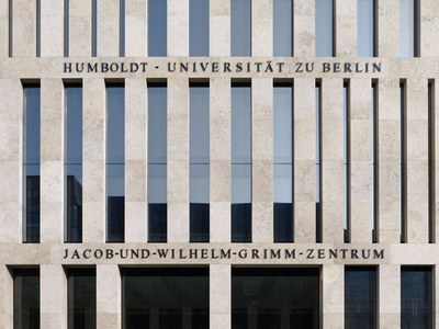
Exterior view of the building [© Photo Stefan Müller]
“Everything revolves around the book, since the bookcase is the underlying motive behind all the supports, corridors, windows, gangways and visual axes… the view through the vast grid-like structure of the main reading room already counts among the most beguiling sights of recent years”. (FAZ, 06.04.2011)
With the Jacob-und-Wilhelm-Grimm-Zentrum, both the University Library and the Computer and Media Service of HU Berlin obtained suitable premises for the first time. The building, opened at the end of 2009, fits in perfectly on the “culture mile” between Berlin’s theatres and Museum Island, as well as providing a new focal point whose benefits, from an urban planning perspective, reach far beyond HU Berlin. Designed by Swiss architect Max Dudler, the building has already received a number of awards: in 2010, the Association of German Architects (BDA) “Nike” award for best urban structure; the “BDA Berlin Award 2009” for exceptional architectural achievement and the “Architectural Award Berlin 2009” for sustainable design of the urban living space in Berlin.
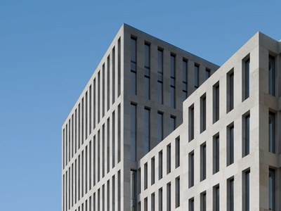
Exterior view of the building from Geschwister-Scholl-Straße [© Photo Stefan Müller]
External structure
The building is made up of two sections of differing heights: with a height of 22 m, the lower part of the building integrates seamlessly into Berlin’s architectural landscape. The southern wing stands opposite at a height of 38 m, marking out the Grimm-Zentrum as an imposing public structure. At the same time, this latter section shades the lower part, and with it the glass roof over the reading terraces. This means that awnings are only required during a few weeks of midsummer.
The cladding on the facade is made from pale yellow Jura limestone, whose structure has been accentuated using a high pressure jet machining process. The polished variant of this material is employed inside as a surface for flooring and stairs.
The facade appears on the one hand to be rigidly structured, though the varying widths of the windows create rhythm, and in turn point to the library’s different areas of activity: shelving systems are hidden behind the narrow windows, while the workspaces are found behind wider windows, with a view of the Berlin skyline. The basic 1.50 m grid reflects the centre spacing of the shelving, and thereby makes a direct reference to the books that constitute the “foundations” of this structure.
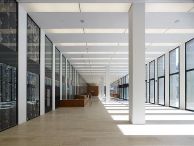
Foyer [© Photo Stefan Müller]
Internal structure
From the outside, its reduced palette of materials and colours, together with a precise, geometrical use of shapes, stand out on their own and give the building a sculptural look and feel. On the inside, the clarity and serenity of the design are propagated through a strictly symmetrical construction, the use of near-natural materials like stone, wood and linoleum, and the colours black and white. Red elements are only employed in areas designed for communication, such as the cafeteria and lounges. American black cherry wood veneer was used for the wall panelling and desktop furnishings, and walnut for the parquet flooring in the reading rooms.
Spread across two floors, the generous foyer area is structured by two cubes, the upper levels of which are an inviting place to take a few minutes’ break. The three entrances and large glass frontage form a conscious connection with the urban environment, while the spacious forecourt plays an intermediary role between interior and exterior.
The artwork “Bullet Holes” by German-American artist Arun Kuplas is situated in the entrance hall. This piece references the immediate urban environment around the Grimm-Zentrum, as well as the history of Berlin and that of the University Library. It depicts details of the columns on Museum Island that have been scarred by the destruction of war, as well as sections of the facade at Dorotheenstraße 1, where the University Library administration used to be housed until its relocation to the Grimm-Zentrum.
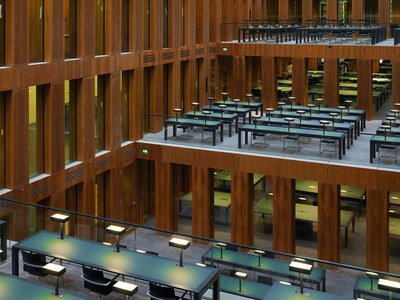
Reading terraces [© Photo Stefan Müller]
Workspaces
In the inner library area, matt black shelves and linoleum floors, as well as white walls, cast a glow on the warm, light red shades of the cherry wood veneer, while the black shelves are lit up in multi-coloured splendour by the myriad book spines.
Five levels of symmetrical workspaces, rising like terraces on both sides, form the centrepiece of the building. Here, acoustic insulation provided by glass doors and walls creates a particularly concentrated working atmosphere. The reading terraces, with their black cherry wood veneer and green linoleum desktops, together with reading lamps made from translucent, green marbled glass, constitute a successful, modern interpretation of the classic reading room.
A glass ceiling made up of 82 individual elements affords an unobstructed view of the Berlin sky, and thereby creates a connection with the outside world.
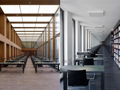
Research reading room and seating in the library’s user area [© Photo Stefan Müller]
Despite the strictness of the design, its symmetrical construction renders the entire building open and transparent, with views through, into and out of every space: from the TV tower to the Reichstag, or through the glass walls straight across the reading terraces, which stretch nearly the whole length of the building.
Individual, peripheral workspaces are positioned along the facades, furnished in the same way and yet providing a counterbalance to the reading terraces. The depth of the desks – also designed by Max Dudler – corresponds to the building’s grid of supports, so that every reader gets a window seat.
The research reading room is on the 6th floor, spread across two levels, where historical and precious collections can be viewed. The same materials have been used here as in the reading terraces. This space enjoys an excellent outlook due to its position on the facade and generous windows. Large glass planes open up a view of the bookcases on the 7th floor, creating an abstraction of the classic gallery setting.
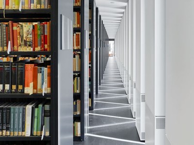
Library shelving systems and lighting in the library’s user area [© Photo Stefan Müller]
Optimum light conditions
The glass ceiling above the reading terraces and the arrangement of workspaces on the facades allows for the best possible use of natural light. Depending on the level of natural light, individual lighting circuits can be incrementally dimmed as needed according to the depth of the room, which helps to reduce electricity consumption. All windows are optimally insulated thanks to foamed cavity insulation zones between the interior and exterior profiles. A baffle pane runs in front of the actual window pane, so that the roller blinds between these two are protected from the wind, and can also be used in the sunny and windy weather typical of Berlin.
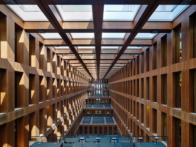
Windows over the reading terraces [© Photo Stefan Müller]
Concrete core activation
Suspended ceilings have been avoided and instead the building service installations are located in the floor or in the concrete ceilings. The pipes in the concrete ceilings that carry supply air lead to a concrete core activation, meaning that the building does not need to be climate-controlled. Supply air enters the concrete ceiling at a temperature of approx. 14°C. By absorbing heat from the ceilings, this air prevents excessively high temperatures from occurring, and is warmed up to room temperature in the process. The only climate-controlled areas are the data processing centre and the archive rooms on the 6th floor, due to the high number of historical collections stored there. These are also located in the centre of the building so that the impact of the ambient temperature remains as low as possible.
